
ALL SYSTEMS GO.
What Acceleration Looks Like…

Markets are in widespread breakdowns.
On Tuesday morning I wrote:
Market feels extremely fragile, Tech/MAG7 especially, as discussed in Sunday’s chart run.
Most are on the verge of an accelerated move lower (rollovers complete).
By Friday, acceleration was clear:
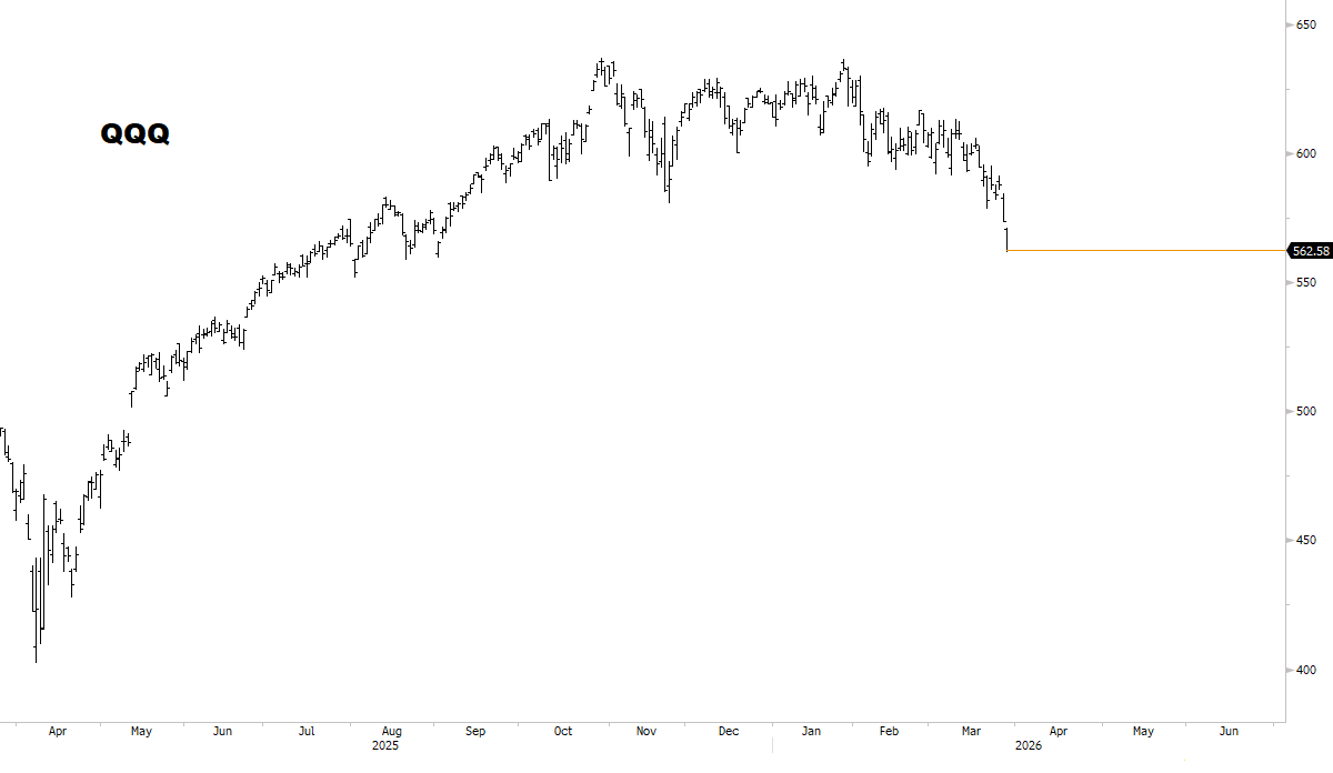
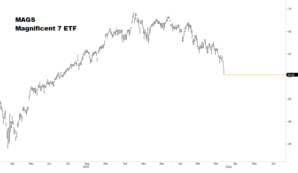
Selloffs are broadening…
Where are we in the corrective cycle?
Panic is beginning to take hold.
For most of March, investors were in a cognitive dissonance bubble:
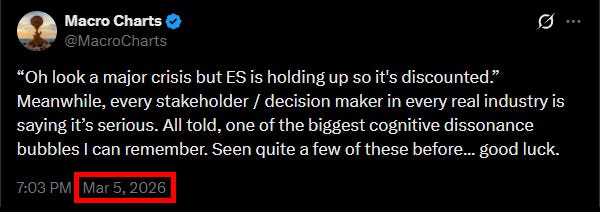
Now, the bubble has met its pin…
Published in our March 4 report:
Typically, choppy market declines end with a “rip off the band-aid” moment.
The ideal sequence would be: first the market wears everyone out, then at the end, triggers a panic — forming the bottom.
Panics typically last […], and are strong Buy opportunities.
By the time the bottom appears, no one wants to buy anymore — because the market broke everyone first, and news at the bottom is max-bearish.
This has been a classic corrective cycle.
Sellers have broken every market in sequence.
“No stone left unturned.”
How much further could this go?
In today’s report:
What Acceleration Looks Like.
Week after week, the weight of the evidence showed risks were increasing. “Slowly, then all at once.”
Preparing for next week: my updated plan at this critical moment.
Always remember: experience to understand what’s happening, paired with the discipline to execute under extreme conditions, is what sets true winners apart — especially in rough times. Stay focused — and good luck to all next week.
Keep reading with a 7-day free trial
Subscribe to Macro Charts to keep reading this post and get 7 days of free access to the full post archives.